Interactive Reporting
Sales Analysis and Reporting Products
Interactive
Reporting User’s
Guide
Interactive Reporting
Interactive Reporting User’s Guide
ã
Interactive Reporting Ltd., 2003
1 Great Island Enterprise Park • Ballingcollig • Cork •
Republic of Ireland
Phone +353-21-4850455 • Fax +353-21-4850454 • Web
http://www.interactivereporting.com
Overview
What all the excitement’s about...
elling
is never an easy business and making the right choices is crucial to any
enterprise’s survival. Sales Interactive
Reporting is a revolutionary new tool designed to quickly obtain the right data
to support key business decisions. The
reports Sales Interactive Reporting can generate range across the totality of
your company’s data and may be readily exported to many other systems.
his manual documents how to get started with Sales
Interactive Reporting and produce precisely-targeted sales reports within
minutes.
Getting started
Your journey
begins...
o start using Sales Interactive Reporting, you’ll need to
have a login-id and password assigned to you by your system administrator. These will give you access to Sales
Interactive Reporting and the sales data appropriate to your needs.


Figure 1
Now, simply fire-up your favourite browser and navigate to
the Sales Interactive Reporting login-screen (your system administrator will
give you the URL).
Enter the login-name and password that your system
administrator has given you, and click on ‘Login’ (in the above example, user jbloggs
is signing-in).
For the rest of this manual our examples will be drawn
from an enhanced version of the Microsoft’s Northwind Traders sample database.
Once you have signed-in, you will be taken straight to the
main Sales Interactive Reporting screen:

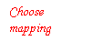


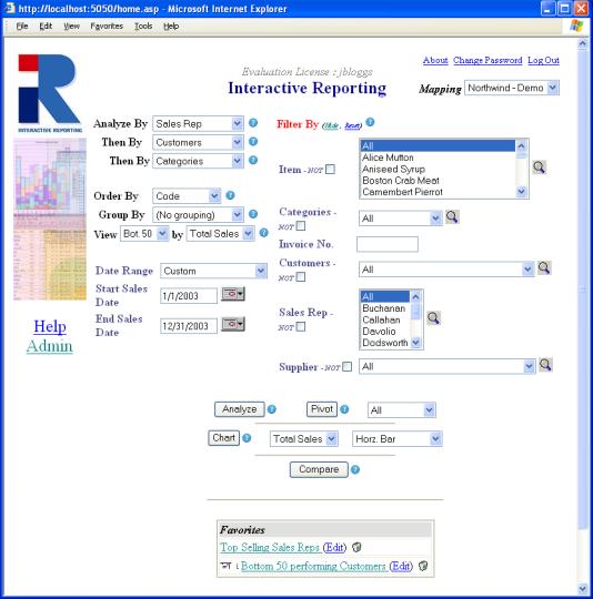
Figure 2
If you wish to look at a data set other than
Northwind-Demo, you can switch by choosing from the dropdown in the top-right
of the screen (assuming your system administrator has made another data-mapping
available to you).
Depending on the data mapping you are using, your screen
may differ from the one shown above.
However, Sales Interactive Reporting has a standardized procedure for
generation of the different types of reports, so don’t worry…
Generating Reports
Putting Sales
Interactive Reporting to work...
ales Interactive Reporting provides a simple and
easy-to-use interface to your company’s data.
It provides a point-and-click means of specifying the sales data you
wish to analyse. The main screen varies
with the data-mapping chosen, but has a consistent structure:
Figure 3
The report variables are the sales information you wish to
analyse. You may specify (using the
drop-down list boxes):
·
Analyze
By – the main variable you wish to examine. In the example above, it is Sales Reps If an analysis is
performed the first page of the report will display the Sales Reps data
for the specified time period.
·
Then By – the variable by which you wish to
perform further analysis. In the
example above the three fields are Sales Rep, Customer & Category. If
an analysis report is generated report will display the Sales Reps data
for the specified time period. If a particular sales representative is then
selected, the customers of this sales representative are then displayed. If a
particular customer is selected then all the categories used by this customer
during the specified time period are displayed.
This indicates how you wish to sort the results of your
report. These are created in the template section. Choices may consist of the
following:
·
Description – sort alphabetically by description
·
Code – sort alphabetically by alphanumeric code
·
Avg Price – sort by average price of item
(calculated as volume divided by qty)
·
Avg Cost – sort by average cost of item
(calculated as COG divided by qty)
·
Volume – sort by sales volume (calculated as quantity
multiplied by price)
·
Margin – sort by profit margin (calculated as price
less margin)
·
Margin % - sort by profit margin (calculated as margin
divided by cost, and expressed as a percentage)
Depending on how your system administrator has configured
your system, the above data may differ.
This optional setting indicates how you wish to have the
results of your query grouped. You may
either select ‘No grouping’ or specify a particular quantity by which to
group. Overall, the results are
identical in both cases, but the latter provides a breakdown according to the
grouping you have specified.
This options lets
you chose how much of the data is displayed. It consists of five values.
·
All: This option lets you view all the resulting data
from your analysis.
·
Top 20: This displays the top 20 values in the
resulting report, sorted by the value in the adjacent box. For example, if you
were analysing by customers and this value was set to Top 20 by Total
Sales, then the result displayed would be the twenty customers with the
highest total sales.
·
Top 50: This displays the Top 50 values in the
resulting report, sorted by the value in the adjacent box.
·
Bottom 20: This
displays the Bottom 20 values in the resulting report, sorted by the value in
the adjacent box.
·
Bottom 50: displays the Bottom 50 values in the
resulting report, sorted by the value in the adjacent box.
Figure 4 shows the
report settings for the Top 20 Customers, chosen by their Total Sales value.
The Order By field is set to Code. If an analysis were performed on Customers
with these settings then the 20 Customers with the highest Total Sales would be
chosen and displayed on their customer code value. The result of an analysis of
the settings on Figure 4 can be in Figure 5.
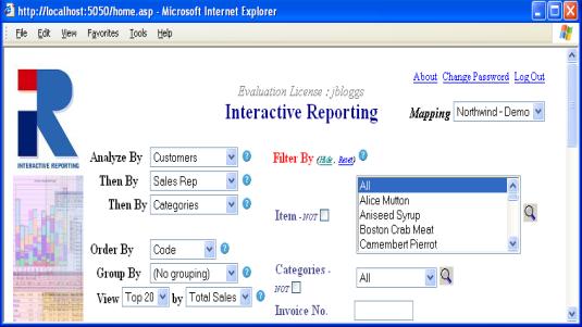
Figure 4
Figure 5
Report
Filters
When generating reports, it is often desirable to restrict
the data that is analysed to only a subset of what is available. Perhaps you are only interested in a particular
category of goods, a specific range of dates or even the revenue generated by
an individual member of the sales team.
Sales Interactive Reporting’s filter mechanism allows restriction of
data through:
·
Text-boxes – simply enter the code/title (as appropriate)
of the information to which you wish to restrict your report
·
Combo-boxes – choose from a drop-down list of the
codes/title for each particular category of information.
·
Start/end dates – restrict the period over which the
report obtains its information (in the example in Figure3, we wish to consider
only sales made between January 1st, 2003 and December 31st,
2003). Dates may be indicated by
entering the date in your local format or by clicking on the calendar
control. A number of preset date choices
are also included (just choose from the ‘Date Range’ drop-down: Last Month, This Month, Last Quarter,
This Quarter, Last Year, This Year, All, Yesterday)
·
Not Filter – This filter allows the user to conduct an
analysis excluding specific elements of a category.
·
Required Field – This filter ensure the user includes
this data in the generated report.
Once you have set all the parameters of your report (the
variable by which you wish to analyse, the ordering you wish to use and the
filters to restrict the data the report will analyse) you can generate the
report you want in an instant.
Available report-types are obtained by clicking on the appropriate
button on the bottom of the screen:
·
‘Analyze’
– a simple one-dimensional report type, which may be grouped, suitable for
producing simple graphs and charts,
·
‘Pivot’ – a two-dimensional report (possibly
grouped) which provides a table of results – using a drop-down list a user may
choose to display a number of quantities such as volume, margin, margin %, quantity or a combined report with all of the quantities.
·
‘Chart’ – a one-dimensional chart, containing
the desired sales-related quantity of interest, for example quantity, volume,
margin, margin %, in the form of a horizontal/vertical bar-chart,
pie-chart or a line graph. Chart formats can be selected from a drop-down list.
In the case where one chooses to group by a certain variable, one obtains a
grouped or stacked chart.
·
‘Compare’ – allows one to compare sales data
across differing time-periods.
One a report has been generated it may be saved (described
later). Shown in the bottom portion of
the screen are the reports that have been saved by a user for the current
mapping. Clicking on the report title
will execute the report, while clicking ‘Edit’ will allow report properties to
be changed and clicking on the trashcan will delete the report. Reports that
will be emailed to users have an email icon associated with them in the
favourite list.
The Hide / Reset link, shown in Figure 4, allows
the user to hide the Filter By fields if they are not in use.
The Help Icon, shown below in Figure 4 as the
question mark in the blue circle, allows the user to gain further information
about a feature. When the icon is clicked a popup window will appear with
additional information and possible examples.
Required Field Icon
The Required Field Icon, shown below in Figure 6 as
the *, indicates that this field must
have a value for a report to be generated. If an attempt is made to generate a
report with this field empty then an error message will appear on the screen.
The Not Filter, shown in Figure 6, allows the user
to conduct an analysis excluding specific elements of a category. Below we can
see that the Sales Rep Not box in Figure6 has been ticked. When an
analysis, pivot, chart or compare is then performed the resulting data will
exclude data only relevant to the sales rep Buchanan.


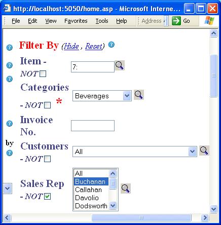
Figure 6
The Select Icon (represented by the magnifying
glass in Figure 6) allows the user to select multiple fields from the filter
categories.
After clicking on the Sales Rep select icon the
following window appears. To select Callahan, Fuller and King simply press and
hold down the Ctrl key while clicking on each name with the left mouse button
on the Search Result box. Then click on the Select Individual Result Button
(second arrow button from the top in Figure 7). You will then see the three
names appear in the Selection box.
The Search field uses ‘wild card selection’ as its
search method. This means that if you place the letter ‘c’ in the search field the names returned
in the left-hand column will be “Buchanan, Callahan & Peacock”, as all these
names contain the letter ‘c’. If the case-sensitive box had been ticked
then only “Buchanan and Peacock” would have appeared in the left-hand column.
The Show All button is used after searched to
display all search criteria in the left-hand column.


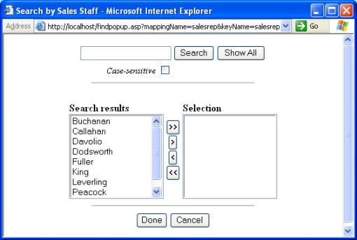
Figure 7
Interactive Reporting now supports Ranged Selection
in text box filter fields such as the Item field seen in Figure 8. The
character “: ” is used as the range indicator. Please note that the date range
is inclusive, i.e. –5:3 is all records including –5 and 3. Examples:
·
-5:3 (from -5 to 3 inclusive)
·
:5 (everything less than or equal to 5)
·
8: (everything greater than or equal to 8).
·
E:G This also works in a case-insensitive fashion for
characters - e.g. E:G will select E, F and G)


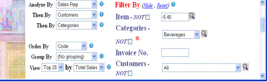
Figure 8
Another method to view a selection of data is to use the View
drop down selection as seen in Figure 6. The associate By field is the
value upon which the Top/Bottom 20/50 are chosen on. This dropdown menu
contains five options,
·
All - to select all the data
·
Top 20 - to
select the top 20 results
·
Top 50 - to
select the top 50 result
·
Bottom 20 - to
select the bottom 20 results
·
Bottom 50 - to select the bottom 50 result.
·
Simple reports
To generate the following report using the Northwind
Traders database proceed as follows. On the home page click on the select icon
next to the ‘Suppliers’ and set it to Pavolova, Ltd. In the Report Variable
section set the Analyze By field to ‘Sales by Quarter’, the first Then
By field to ‘Sales Rep’ and the second Then By field to
‘Categories’. Set the dates to those in the report below. Then click on the
Analyze button. This will generate the following report.


Quarterly sales
(sorted by increasing Margin %)
|
|


Data-mapping used for analysis
|
|
Export results to MS-Excel
|
|
Compare with another time-period
|
|


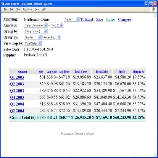
Figure 9
When a report is generated, a number of quantities of
interest are calculated. These may
include:
·
Qty – the
quantity sold
·
Avg Cost – the average cost of goods
·
Avg Price – the average price of goods
·
Total Cost – the total cost of goods
·
Total Sales – the total cost of sales
·
Profit – the profit margin
·
Margin % - the percentage profit margin
Depending on the information available (which is
constrained both by the original source of data and by what has been made
available by your system administrator), not all of these quantities may
appear. Specifically, if cost is
not available, then average cost, Total Cost, Margin and Margin
% cannot be calculated. Charts of the results may be obtained by choosing
from the ‘Chart’ dropdown (described later).
Excel
If you wish to work with the above data outside of Sales
Interactive Reporting, the table of results generated can be quickly exported
to Microsoft Excel by clicking on the ‘To Excel’ link.
The report may be saved as
a favourite by clicking on ‘Save’. Clicking ‘Save’ will persist the
report.
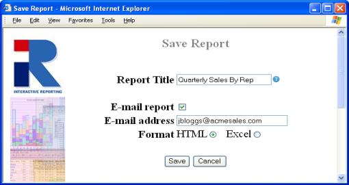
Figure 10
When saving, one must specify a title for the report. Note
that the date range type effects the data displayed when a favourite is clicked.
If the report was saved with an absolute (explicit/customised) date, e.g.
31/12/03, then the report will always show the data for that date range. If
however the report is saved with a template date such as ‘yesterday’, every
time the favourite is access the data is updated to reflect yesterdays data.
It is possible to have the report e-mailed on a scheduled
basis (via the Server tool), by selecting ‘E-mail report’ and entering a valid
e-mail address. . To send the report to multiple recipients simply separate
email address by a comma. Your system administrator will set the frequency of
these emails, normally once a day. E.g. if you save a report as a favourite
with the date range set to yesterday then you will receive an update report of
the previous days data every morning. Favourites, which are saved as E-mail
favourites, will have a letter-icon next to them in the Favourites List
for ease of identification.
Compare
The sales data displayed in the report may be compared
with data from a different by clicking on the ‘Compare’ link (described later).
Drill Downs
With any report that has been generated, obtaining a
report at the next level of indicated granularity is simply a matter of
clicking on the relevant link in the report table. This process may be repeated until the greatest level of
granularity has been attained.
In our Northwind - Demo example, when specifying the
analysis to be performed, we indicated that we wished to first analyse ‘Sales
by Quarter’ and then analyse by ‘Sales Rep’.
To examine the sales for a particular quarter, we simply click on the
appropriate link in the above table.
For example, we may examine sales for the most profitable
quarter (in terms of highest percentage margin it is the second quarter of
2004) by clicking on the ‘Q2 2004’ link (we are, of course, still restricting
ourselves to those sales supplied by Pavlova Ltd). This will
take us to an analysis of Q2, 2004 by ‘Sales Rep’ as can be seen in Figure11.
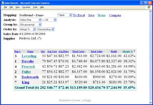
Figure 11
We see that the start- and end-dates of the analysis have
adjusted themselves to select the second quarter of 2004 and that the report
lists the sales figures of each of the sales representatives by decreasing
percentage margin. As in the previous
report, various quantities are calculated (i.e. average cost, average price,
Total Sales, Profit, margin, percentage margin) and column totals are provided.
The third variable by which we specified we wished to
analyse was ‘Categories’. To view the
categories sold by a particular salesperson in Q2 of 2004 (and supplied by
Pavlova Ltd), simply click on the appropriate link.
In our example, clicking on the salesperson with the
highest percentage margin (in this case Leverling) shows that his/her highest
percentage margins where obtained from the sale of condiments and beverages:
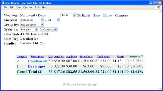
Figure 12
We may examine the details of Leverling’s sales further by
clicking on the appropriate link. If we
click on ‘Condiments’ – the category of sales supplied by Pavlova Ltd over the
specified period, we can obtain the line-details from the relevant invoices:
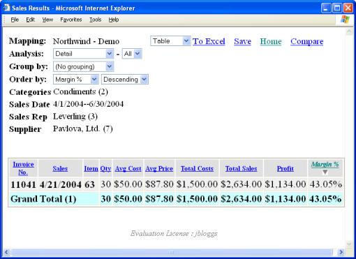
Figure 13
We see that Leverling’s condiment sales for Q2, 2004,
supplied by Pavlova Ltd consisted of exactly one batch (from invoice 11041).
The greatest level of granularity that can be obtained in
a report is the individual entries on a particular invoice - one can always
‘drill-down’ through a series of reports to this level of detail.
To return to a previous report or to the main Sales
Interactive Reporting screen, simply click on your browser’s back button
or the Home link at the top of the page.
Using the dropdown on the main screen or indeed when
looking at a particular analysis report, one can choose to group the results
following a particular categorization.
As an example, taking the report produced above (in Figure 9) and
grouping by ‘Categories’ on the ‘Sales by Quarter’ report gives
us:
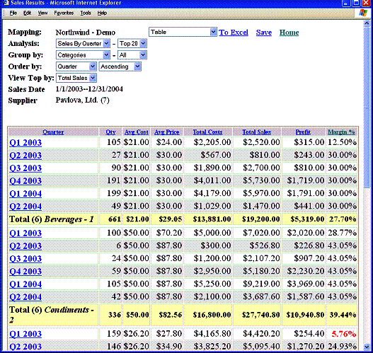
Figure 14
We can see that a grouped report produces subtotals of the
quantities of interest for each of the categories of goods. Also, a grand total of these quantities are
given at the bottom of the report.
One may change the grouping variable or revert to the
simpler analysis given earlier by selecting as appropriate from the ‘Group by’
dropdown.
Using the Northwind Traders database, with variables and
filters specified below (see Figure 9.), clicking on ‘Pivot’ generates the
following report:

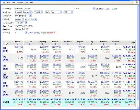
Figure 15
When performing a pivot-report, the first variable
specified for the analysis (through the ‘Analyze By’ drop-down of the main
screen) specifies the rows of the report and the second variable specified for
the analysis (specified using the first ‘Then By’ drop-down) specifies the
columns of the report.
In our Northwind Traders example, we chose to ‘Analyse By’
Sales by Quarter and ‘Then By’ Sales Rep. The resulting report
then has Sales by Quarter listed along its rows and Sales Rep.
listed along its columns. The figures
presented in the body of the table are thus the total sales, profit and margin % of each salesperson per quarter
(filtered, of course, to examine sales between January 1st, 2003 and
December 31st, 2004 which were supplied by Pavlova Ltd).
The rows and columns may be switched by clicking on the
‘Switch’ icon in the top left cell of the table.
From a pivot report, one may zoom-in to a greater level of
detail in three different ways. You may
click on a:
·
Row heading – this will produce a simple report
which has been filtered to only include data from the row you have
clicked-through
·
Column heading - this will produce a simple
report which has been filtered to only include data from the column you have
clicked-through
·
Sales figure – this will produce a simple report
which is filtered to include only those sales which contribute to this
particular figure for sales volume (i.e. filtered to include data from both the
relevant row and column)
In our Northwind Traders example, clicking on the ‘Q2
2004’ row heading produces a report (ordered, of course, by percentage margin),
which is filtered to include only the relevant dates:
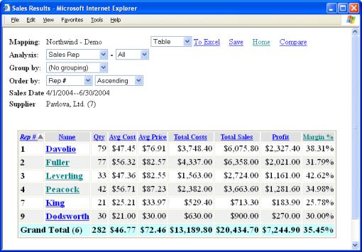
Figure 16
Clicking on the ‘Leverling’ column heading (3) in the
pivot report (Figure 15) produces a report (ordered by percentage margin),
which is filtered to include only those sales that were made by Leverling (and,
of course, supplied by Pavlova Ltd):
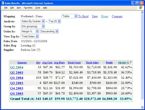
Figure 17
Clicking on the sales figure of $12,881.50 in the pivot
report (Callahan’s sales for the fourth quarter of 2003 in Figure 15) shows how
Sales Interactive Reporting arrived at this figure for sales volume:
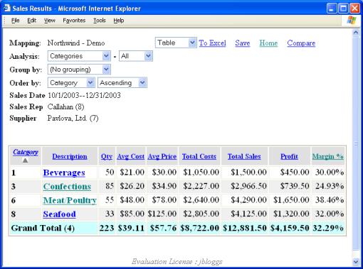
Figure 18
As before, you may click through the relevant links to
obtain reports of increasing granularity, ending with individual invoice
details.
Reports may also, by clicking on the appropriate links, be
saved, exported to Excel or charted.
As with simple reports, pivot reports may be grouped
according to a certain criteria – it is simply a matter of specifying a
variable by which to group in the drop-down (this currently cannot be performed
directly from the main screen – you must first click the ‘Pivot’ button on the
main screen and then change the grouping using the ‘Group by’ dropdown). An example report is a pivot of Quarterly
Sales against Sales Rep., grouped by Customer (restricting ourselves to those
goods supplied by Pavlova Ltd):
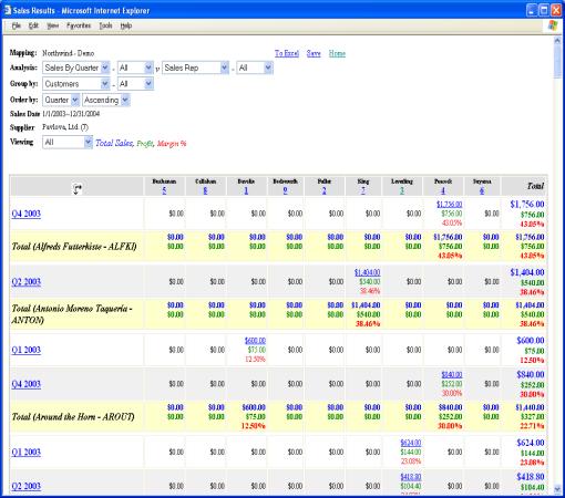
Figure 19
As before, one can click on a particular value to see how
it was calculated. Also, clicking on a
row heading will produce a simple report upon the row’s information (within the
specified group) and clicking on a column heading will produce grouped report
restricted to just that column (in the above case, effectively filtering by the
chosen sales rep.).
One of Sales Interactive Reporting’s most powerful
features is its ability to provide interactive charts of data. When performing straightforward 1-D analyses
(as described earlier), one may zoom-in to the next level of detail by clicking
on a link. This unique feature is also
available through charts.
Using the Northwind Traders database, with variables and
filters specified as above (Figure 9), clicking on ‘Chart’ generates the
following horizontal bar-chart of sales volume:


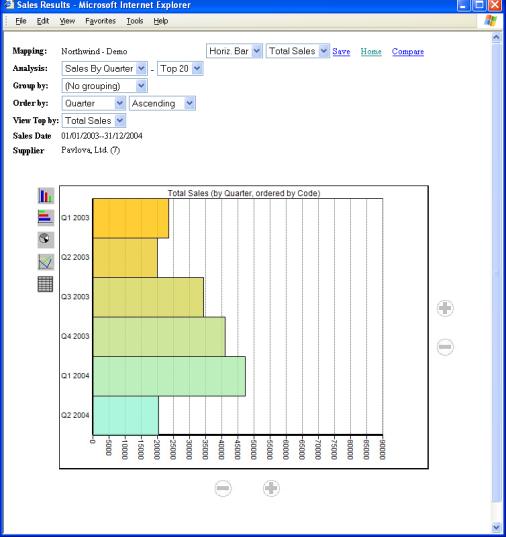
Figure 20
One may choose the variable to be charted by selecting,
from the display quantity drop-down, one of Total Sales, Margin, Quantity or Profit, just as
when producing a pivot-report.
One may view the results in a vertical bar chart, a pie
chart, a line graph or the corresponding table by choosing from the display
drop-down along the top of the screen or clicking on one of the icons on the
bottom left of the chart. As before,
one can save as a favourite report by clicking on ‘Save’.
Again, if there is a large amount of data present the view
may be changed to reveal only the top 20 or top 50 results by simply clicking
on the second dropdown menu associated with the Analysis menu.
The Order By menus allow the data to be displayed
from ascending to descending order or visa-versa. It also allows the way in
which the data is ordered to be modified, e.g. by quantity, by profit, by
average cost, ect.
Just as tables allow drill-down, so do charts. For example, clicking on the bar associated
with the ‘Q4, 2003’ volume, will give a bar-chart of each sales rep.’s
performance during that quarter (similarly to zooming-in with the tabular
‘Analyze’ report):
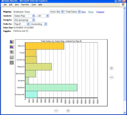
Figure 21
As before, one may recursively drill-down until the
greatest level of granularity is attained (that of invoice detail).
Just as one can group the results of a simple tabular
analysis, one can also produce corresponding grouped charts. One simply
(if a chart is already being displayed) changes the ‘Group by’ dropdown
from ‘No grouping’ to the desired grouping.
Alternatively, the grouped chart may be produced from the main screen by
specifying the desired grouping and clicking on ‘Chart’. A final means is to change the selection in
the display format dropdown (as one did when, e.g., switching between a
pie-chart and a line-graph – for grouped charts, however, the available chart
formats are somewhat different).
The chart of the earlier grouped report is:


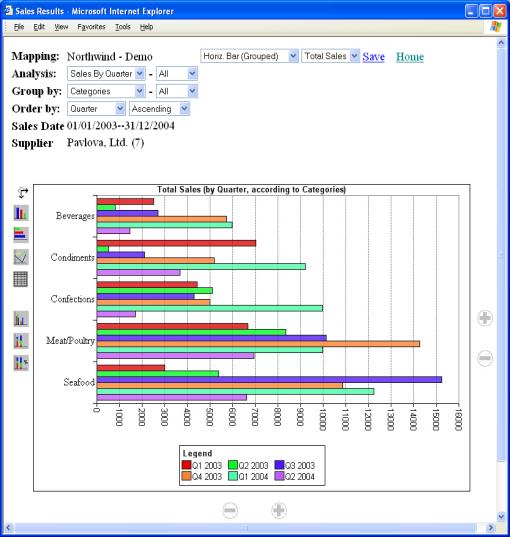
Figure 22
The stacked version of this is:
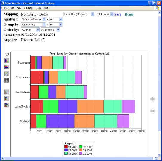
Figure 23
There are several ways in which the data may be grouped
within the chart. These correspond to
the extra buttons on the bottom left of the chart. One may produce grouped, stacked or stacked-%
versions of the bar charts previously available.
Clicking on the ‘Switch’ icon may alter the grouping of
the data.
As with charts of simple reports, one may click on a
quantity of interest to view a more detailed chart of that quantity. Below is chart resulting from clicking on
the Q3 2003 Seafood cell in the above chart:
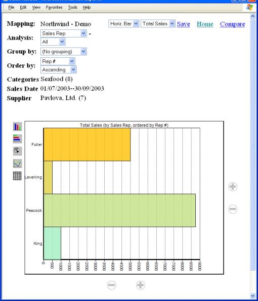
Figure 24
We can see that sales of seafood made during Q3 2003
supplied by Pavlova Ltd were made by just four of the sales reps., with Peacock
being responsible for the greatest volume.
As one can chart simple analyses, so one can also chart
pivot reports. Analogously to how one
produces simple charts, pivot reports (must have ‘No grouping’) can be
charted by selecting the desired chart format from the dropdown at the top of
the screen. As with grouped charts,
there are several varieties (grouped, stacked, stacked-% available) and the
icons on the bottom left of the chart may be used to switch between the various
possibilities.
The example below shows a stacked vertical bar chart of
sales margin on goods supplied by Pavlova for each quarter and for each sales
rep.
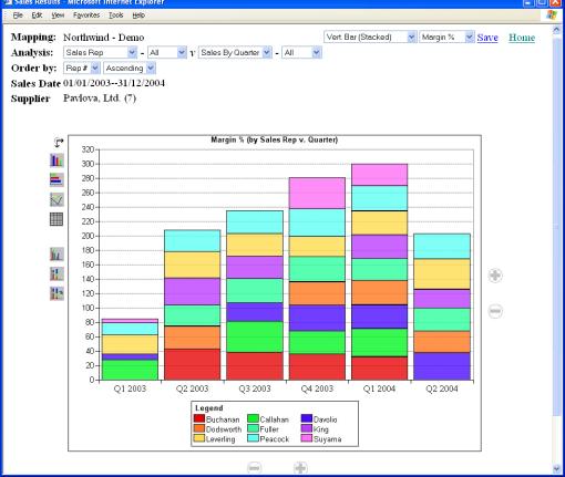
Figure 25
This type of chart is broadly similar to the grouped chart
presented earlier and, similarly, allows drill-down into further detail as,
e.g., with the Q4 2003 sales of Davolio of Figure 25:
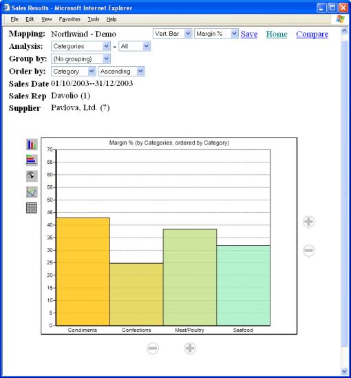
Figure 26
One of Sales Interactive Reporting’s most powerful
features is its capability to compare sales data across different time-periods.
To access this feature, click on either the ‘Compare’
button on the main screen or the ‘Compare’ link on a report screen. You will be taken to:


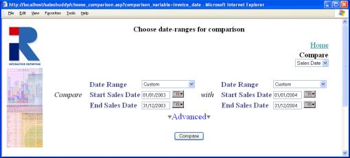
Figure 27
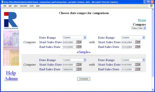
Figure 28
The comparison choice screen above allows one to produce
one comparison reports. To produce two
comparison reports click on the Advanced button. The following window
will appear
In the above example of Figure 27, the choice that has
been made is to compare sales data with invoice dates from 2003 with data from
2004. Clicking on the ‘Compare’ button
for the Simple Report (Figure 27) will give:
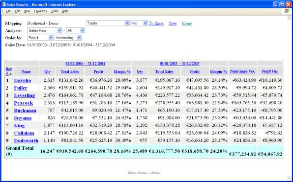
Figure 29
As before, one can drill-down by clicking on a link. Here, clicking on a sale rep’s name will perform a comparison across the
same date-ranges for that particular rep., examining what is specified by ‘Then
by’ on the main screen (in this case, by Customer). The report for Buchanan is:
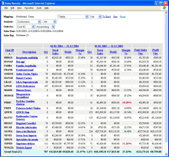
Figure 30
Charts of comparison reports are similar to the grouped
reports already discussed. To obtain a
chart of a comparison, simply choose the appropriate format from the
drop-down. As an example, a chart of
sales rep. performance (in terms of total sales) comparing 2003 and 2004 is:
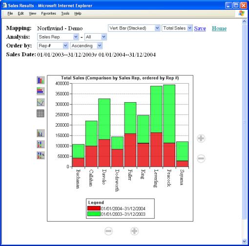
Figure 31
The quantity being compared may be changed by choosing a
different quantity in the drop-down at the top of the screen. As previously, one may drilldown into the
report by clicking on a cell of interest and changes the format of the chart by
either clicking on the chart icons or choosing from the dropdown.
Getting Help
What to do if
you’re lost...
or any problem that you’re unable to resolve using this
manual, particularly if you are having problems signing-in or if you feel that
data that should be available is not visible, your principal resource should be
your system administrator.
lternatively, you can look for assistance from the
‘Support’ section of Interactive Reporting’s web-site:
http://www.interactivereporting.com
or simply e-mail your query to:
supportteam@interactivereporting.com